Friday, 29 April 2016

Final poster designs


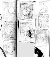
I've made these two posters based on a boxed design. I like the idea of showing a large image of the planet's surface with some information neatly placed beneath it. It's a lot more simple, but more striking. I need to see how the more featureless planets like Neptune and Uranus turn out, but for the moment I'm very happy with this. The aim is to have all posters as 2-colour screen prints. 

I have 4 print slots over the next two weeks, so will try and get as many designs done for each of these slots as possible. I'm beginning to think I might not be able to actually screen print the book in time for the deadline, but i'll propose it and print it afterward if need be. This new approach to the posters means I'll have to re-think the way the book appears in order for them to work in tandem.

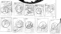
Here are the thumbnails which I made when I decided to do a close up of the planets' surfaces.

Tuesday, 26 April 2016

Posters roughs

Based on the thumbnails I did for posters after looking at Simon Page, I designed the above roughs. I initially felt really good about them, but once I tried to take them into production, I had a lot of problems with actually pulling the designs off.


Venus and Uranus showed some promise, but I feel as though the rough brush aesthetic was starting to fall apart once I applied it to large poster designs and getting the balance of negative space from poster to poster was hard as the set started to look messy.
I think the layout needs to be tweaked to be more uniform and tidy.

Monday, 25 April 2016

Printing developed drawings

Decided to take the more developed ink drawings I have of Mars and Venus and screen print them to see how they were looking, and it turns out they're looking pretty good. The colours still aren't accurate since I just want to get through what little ink I have left, but I colour corrected Mars on the left image to a more intense red to get a better idea of what it will look like.

These two scans are both on Somerset, one white and one off-white. While I initially wanted to go ahead and use the off-white, it's a lot more textured, causing a lot more noise on the design due to not being able to take the ink as smoothly. This is a nice effect in some areas, but where I would like to have block colour, it becomes annoying.

Portfolio

Saturday, 23 April 2016

Simon Page's Astronomy posters

https://www.creativereview.co.uk/cr-blog/2009/november/international-year-of-astronomy-posters/

I discovered this guy and his astronomy posters which, despite starting out as a self-initiated project, were discovered by the International Year of Astronomy organisation and ended up being used by them.
Even though they are more on the graphic design side of things, I really like them, particularly the way each image has its own composition but can be taken as a set just by the consistent type treatment.
It made me realise that the ideas that I had for my posters were really boring and needed sprucing up.


I've decided that I want each poster to be a full bleed design which allows me to convey the character of the planets more easily, as I'm not just relying on the planet themselves - I have the whole frame to play with. The characteristic of the personality that I portray will be linked to the short text on the poster (i.e., Venus' heat, portrayed by fiery brush strokes and Mars' dust etc.)

More of Simon Page's space-related stuff:
http://excites.co.uk/filter/Space

Poster design

In between print tests, I'm trying to get the design of the poster series done.

I thumbnailed a few potential designs, also taking into account how well they would accommodate awkward shapes created by Saturn's and Uranus' ring systems. I then roughly mocked them up on Photoshop:

The first two have made me realise that I thumb nailed too much type onto the posters - I'd better keep the rest of the information for the book. I think the amount of type on the third landscape poster is more suitable, so will now continue to mend the other designs.

Thursday, 21 April 2016

Further print tests


Did some screen printing today of the more refined brush and ink drawings of Mercury, Mars and Jupiter. I did them all orange, even though Mercury is actually grey coloured, just for simplicity at this stage. Somerset unsurprisingly takes the ink the best, though I only tested on the off white somerset which alters the colour slightly. 

A lot of the texture behind the linework wasn't supposed to be there - the image didn't wash out very well after exposing. I presume this was because I printed my positive using the studio printer and it doesn't handle solid black very well, but Mike said that if I find the screen hard to wash out it could be that it's been over-exposed and I should try out using only 150 light units as opposed to 170. I'll try that out next time I do some print tests.

This is closer to the sort of colour mercury would be:


Wednesday, 20 April 2016

Planet ink drawings

These are some larger scale ink drawings that I did in order to try and refine the planets I've done so far - Venus, Mercury, Earth, Mars and Jupiter. Jupiter and Earth are proving to be very difficult to do, and I don't think I've quite got there with Venus or Mars either - I'm pleased with Mercury though as it's simple like the planet (second to last).

I think I need to try and simplify the forms of the planets in order to make them more graphic, but I want to still be expressive with the brush strokes as I think this will help imply more of a sense of character or wonder in the planets. This should be easy enough to do with Venus, what with it being a big ball of fire like the sun.

Screen printing from sketch book


In the latest group tutorial it was said that I've not been pro-active enough for this project and the fact that I haven't started screen printing yet was a big problem - so I scanned in various different types of illustrated planets from my sketchbook and prepped them for screen printing to see what aesthetic translated best. 

Naturally, the bolder line drawings printed really well, but I'm more attracted to the expressive brush work of the larger ink drawings - I think that if refined a bit more and bitmapped, they have the potential to be more impactful when screen printed

OUIL603 Brief 9 - Boards


Full evaluation here.

I think the idea of making multiple images out of one image is a really interesting way to construct images, and a really effective way of making a product range that ties together well.
I think that the type of imagery stands out from the rest of my portfolio, which is counter productive to what I have been trying to do, but having spoken to some people from the industry in PPP, they said that being able to show a range of approaches to image making is good for a publishing portfolio.

OUIL603 Brief 8 - Boards


Most of the positive feedback that I have received for my series of book covers has been aimed at this Lolita one. I was surprised by this since it only took a few hours to complete the cover, and then only an extra day's worth of work to do the rest of the product range, including the animation. I was always pleased with the image, but I am now beginning to be able to see more value in the piece in terms of the space used and composition and the muted colours which are working really well. The colour palette has translated really well across all the products.

I really enjoyed making the animation as well. It is something that I'd like to get better at in order to tackle more ambitious ideas related to literature.

OUIL603 Studio Brief 7 - Boards


Evaluation here and here

Tuesday, 19 April 2016

Book poster screen prints

I want to sell some screen prints at the End of Year Show Art Market, so decided to adapt the Lolita and Clockwork Orange illustrations I did into posters. I will sell The Bell Jar one as-is.

A Clockwork Orange will be two colour, Lolita will be four colour. This will be my first four colour print.

I don't have time to print these till after the 603 hand-in since I want to work on the Big Kahuna, but since I have a digital print slot tomorrow I thought I should get the positives ready for then. Hopefully whoever is in charge of curating the end of year show art market will think they have potential to be good enough to sell.
Considering I (under)sold my A2, 2-colour Flight Facilities print to that woman for only £35, I want to price these at a more reasonable price on my part.

Monday, 18 April 2016

Updated brief for Big Kahuna

Here's the updated brief for my Big Kahuna project Astronomical. I've fine-tuned the project's deliverables a little bit and been a bit more specific about what it is I want to produce.

I'm abandoning the idea to make something 3D

Sunday, 17 April 2016

http://www.newyorker.com/tech/elements/with-summer-coming-can-the-zika-virus-be-contained
https://www.newscientist.com/article/2084524-we-are-zombies-rewriting-our-mental-history-to-feel-in-control/
https://www.newscientist.com/article/2083292-follow-the-life-of-the-last-man-on-the-moon/

Saturday, 16 April 2016

Idea for a 3D piece/installation

I began to think a bit more about making something experiential, like a sculpture to represent the solar system as mentioned in the last post, but I'm realising that time is running out and I've never built anything before, so to attempting to build something at this stage is not very smart. I'll have to abandon the idea. These were a couple of the sketches I made for this idea though:


The bottom image shows an installation that would require an insane amount of space in order to make accurately. Not very feasible.


Tuesday, 12 April 2016

Jupiter poster thing

I did this big ink drawing of Jupiter and then tried to turn it into a poster. This is the sort of direction that I think would be interesting to take with the rest of the planets. I think I did a really good job of capturing Jupiter's storms, but the layout would obviously need refining and standardising for the rest of the planets.

Thursday, 7 April 2016

OUIL603 Studio Brief 3 - Boards


Full evaluation in the next post, or here.
Disappointed I didn't get around to printing out the transparency, but I still think it makes for a strong portfolio piece, unique to the other book briefs I tackled in the module.

Wednesday, 6 April 2016

Electric Sheep - cover design complete

I never made the transparencies for The Versions of Us cover that I did but I do really want to make this one. I asked in digital print though, and apparently if you print on acetate in colour it turns out translucent. This initially put me off, but I checked to see what the musculature would look like laid out translucent over the android and it looks alright:

So I might just go for it because it would be nice to have. 

The book without the dust jacket and the dust jacket on its own. The same format of mock up used for The Versions of Us. The blueprint notes are bits of info taken from the book about the functions and features of the Nexus-6 type androids

I think that this makes for a really interesting portfolio piece - I haven't been able to get around to doing interior illustrations which is a bit disappointing, but I'll try and do an appropriate range for product distribution to beef this up a bit. I think it's also good that it stands out a bit more in the portfolio as a different sort of illustration to what else is in there.

OUIL603 Studio Brief 5 - Boards

This brief comprises multiple smaller, Responsive-style briefs:

Secret 7"
Even though I didn't get any pieces into Secret 7 again this year, I'm still really pleased with what I've produced for the competition this year. I think the images I've made are really strong and hold up on their own as standalone images, particularly the two ones for Max Richter's Dream 3. I think the use of colour on these images, but also on the psychedelic images is intelligent. I'm surprised I was able to use such a garish colour palette successfully on the more psychedelic images as I usually tend to shy away from using such bright colours, especially if there's more than one. Music is something that I'm really passionate about, so the personal success I feel with these images has inspired to try and get my illustration work more interlinked with it in the future.


Orion Creative Competition, binding design
This has been an interesting brief to tackle since I took the concept a lot further than what I initially planned to do. I initially planned to only do one panel of the triptych described in the brief, but when I felt unsatisfied with the simplicity of my outcome, I decided to do all three, and then eventually apply the three illustrations to a book jacket. I'm glad I did, as having just the three illustrations on their own in my portfolio wouldn't have been very interesting - but now I have a portfolio piece that shows consideration into how my illustrations can be turned into functional products, and interesting ones at that. The process of making the illustrations where I can overlay different things onto the same background was time consuming, but incredibly interesting. I would like to see how this can be explored further (in publishing and other areas) to create more meaning and intrige behind my illustrations.


Penguin Random House Design Award, book cover and accompanying imagery
Evaluation here.

Electric Sheep - muscle development


I experimented with three ways of portraying the muscle layer of the cover design - first was purely digital coloration, which betrayed the level detail I had gone into with the line work. I also had in mind what Henry Steadman said about my book covers not being diverse enough (probably too digital), so the second attempt was watercolour but I didn't feel it was striking enough. 

What eventually did work was digital painting + a mono print texture set to 'screen' in order to give an old fashioned grainy effect. I think this will contrast well with the android blueprint on the layer beneath. It's pretty different to the way I approach colouring in my illustrations usually.

Tuesday, 5 April 2016

Electric Sheep - Cover drawing


These are the two completed line drawings for the front cover of Electric Sheep. The android figure has been done in pencil since I want the revealed layer to be like a blue print sheet. Pretty happy with how both of these have turned out.

Re-thinking Electric Sheep

I'm re-thinking what I'm going to produce for this brief - I'm making the same mistake I did at the beginning of my 505 project last year by making full colour illustrations for what seems to be a paperback - This doesn't really tend to happen in real life. It also ends up making the brief pretty much exactly the same as the War Horse brief - SB4. It seems like I'll just be repeating myself.

I like the idea of making a hardback special edition, similar to what I did with the Orion Creative Competition. The idea is very similar to have an interactive edition with a dust jacket, except this one wouldn't come with multiple jackets, just one:
The dust jacket has the muscular structure of a human on it on a transparency, but when you remove it you have the blue prints to an android. This means I'm scrapping the book cover I previously made for the book.
If I have time I will do at least one inner illustration, but I want to work on making this cover really really nice first. I'm scrapping the previous inner illustration with the empathy box in the last post.

Monday, 4 April 2016

OUIL603 Brief 5c - Boards


Orion Creative Competition

This has been an interesting brief to tackle since I took the concept a lot further than what I initially planned to do. I initially planned to only do one panel of the triptych described in the brief, but when I felt unsatisfied with the simplicity of my outcome, I decided to do all three, and then eventually apply the three illustrations to a book jacket. I'm glad I did, as having just the three illustrations on their own in my portfolio wouldn't have been very interesting - but now I have a portfolio piece that shows consideration into how my illustrations can be turned into functional products, and interesting ones at that. The process of making the illustrations where I can overlay different things onto the same background was time consuming, but incredibly interesting. I would like to see how this can be explored further (in publishing and other areas) to create more meaning and intrige behind my illustrations.

OUIL603 Brief 5b - Board

Secret 7"
Even though I didn't get any pieces into Secret 7 again this year, I'm still really pleased with what I've produced for the competition this year. I think the images I've made are really strong and hold up on their own as standalone images, particularly the two ones for Max Richter's Dream 3. I think the use of colour on these images, but also on the psychedelic images is intelligent. I'm surprised I was able to use such a garish colour palette successfully on the more psychedelic images as I usually tend to shy away from using such bright colours, especially if there's more than one. Music is something that I'm really passionate about, so the personal success I feel with these images has inspired to try and get my illustration work more interlinked with it in the future.

OUIL603 Brief 5a - Boards


Penguin Random House Design Award, book cover and accompanying imagery
Evaluation here.

Sunday, 3 April 2016

OUIL603 Studio Brief 4 - Board

Folio Society War Horse.
Evaluation for the updated War Horse illustrations can be found in the two previous posts labelled OUIL 603 Studio Brief 4, here and here.

OUIL603 Studio Brief 1 - Board


Screen Printed Gig posters

This was an incredibly fun brief to tackle and begin level 6 with. 
Having developed a passion for screen print over the course of my degree, to produce a series of prints at a large scale every two weeks made for an exciting project. I'm pleased with how varied all the prints are in terms of the techniques employed and colours/stock used. Having explored these techniques on large scale prints meant that I was able to really nurture my skills in screen print which has been valuable for the rest of the year when undertaking other screen printed projects (the same for post-graduation). 

As well as developing skills in screen print, the posters were an exercise in typography and graphic design, again with each one trying something new such as the handwritten GRIMES text. I would have liked to have continued this brief throughout the year to see how much better the quality of my printing would've gotten by the end, (especially as I began to experiment with thicker stock like somerset paper and different sizes - 18"x24") but it was difficult balancing this alongside developing the rest of 603.

Friday, 1 April 2016

Electric Sheep development

I started designing what I imagined Rick Deckard looks like based on the very little description given in the novel and also began to thumbnail some of the scenes I had listed:


I began to develop one of the thumbnails depicting the character J.R. Isidore holding the handles of an empathy box into an illustration and tested some colours:
While the glowing effect of the handles looks cool, I can't help but feel as though this image is falling incredibly flat so far. I'm not feeling very motivated to continue with it.