Thursday, 18 December 2014

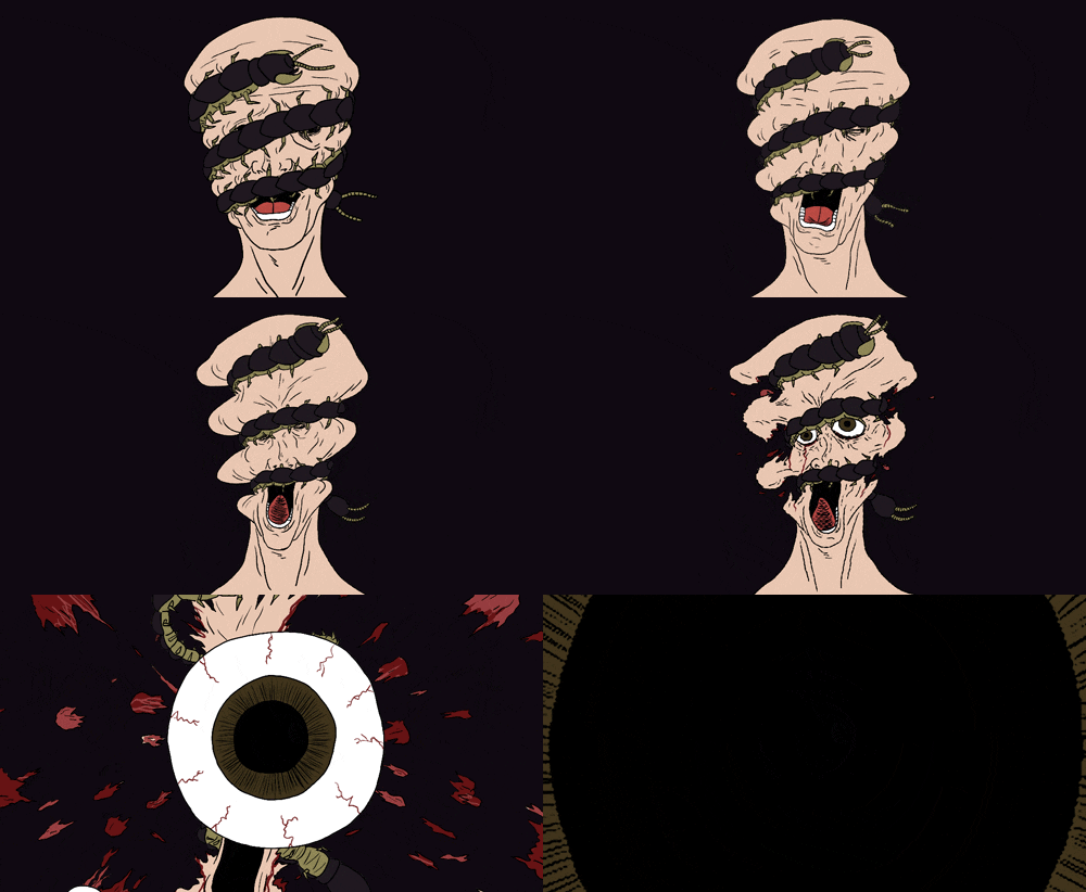
more animation progress


Evaluation so far:
-This went well but took a long time so I don't think I have time to go into this much detail with the rest of the animation. The rest of the animation will be in black and white/grayscale. Part of it will be rotoscoped as mentioned before

-Used a trick Fred suggested to me for the Talking Asshole animation - zoom in to save time and give myself less to draw. This slightly changes how I perceived the animation to appear in my head (where the eyeball is the only thing to get closer to the screen) but was well worth doing in the interest of time

-I started colouring it and realized it was a bit too saturated. Was too late to fix on Photoshop so I'll do this on After Effects

-The above isn't finished yet but I need studio access with After Effects to do layered animation that would be too confusing to do in Photoshop. I think this is the most interesting part of my animation though so I'm happy to have spent so long on it


Saturday, 6 December 2014

Etchings so far


I achieved some strong tonal contrast with these and this has made the etchings pop. They now feel more like etchings and less like sketches. The dark edges around the first one is what helped this whereas the dark suit of the second already had achieved this.

Update with last two characters:

Pleased with these ones too but unfortunately I didn't put enough etching ground on the copper plates so a lot of the plate accidentally got eroded around the edges when I put it in the acid bath. This looks cool and the messy aesthetic works but it's just a shame that the first two don't have this - although I could potentially try and leave a bit more ink around the edges of the first two so that they match a bit better

Thursday, 27 November 2014

Responsive - initial ideas

These are some initial sketches I did for my Syfy landscape idea featuring the logo in various settings:


To make it more interesting, I decided I would design a spaceship that would feature in all the landscapes and have the Syfy logo on it somewhere to represent the brand. I looked at jet airplane engines for some inspiration on the structures/shapes

SELF-SET BRIEF:
To produce a series of images that will work to promote Syfy. These images will feature a spaceship that will appear in various sci-fi related landscapes - it will work across multiple formats: animated web banner, poster, advertisements

PRODUCT:
5 animated web banners to be adapted into A-format landscape posters.

AUDIENCE:
18-25 year old sci-fi fans, both male and female

TONE OF VOICE:
The dramatic sci-fi artwork seen in a lot of the concept art by people like Ralph McQuarrie. Serious tone of voice that will suit the demographic and impactful nature of the greatest sci-fi programmes

CONTEXT:
Will exist online or in a magazine.

ADDITIONAL INFORMATION/CONSIDERATIONS:
The series of images will work as a sequence - from the lift off of the spaceship from a hangar, several different planetary landscapes, and the return of the ship

MANDATORY REQUIREMENTS:
Must not alter the Syfy logo or the "Imagine Greater" slogan

DELIVERABLES:
5 x A-format images to go in magazines for advertisements
5 x animated web banners derived from these advertisement images

Monday, 24 November 2014

Printed Pictures Revised Proposal + Self-set Brief

I intend to produce ……
A series of 6 A5 etchings – 4 of which will depict characters which I have found to be vividly described in William Burroughs’ “Naked Lunch”, and 2 of which will be thematic in content (also relevant to “Naked Lunch”). One of these will depict a black centipede in reference to the black meat drug in the book, and the other will depict scarred limbs.

The content will focus on (identify 3 specific themes, texts or concepts)
1. I will have a vein motif running through prints to tie them together and represent heroin addiction
2. The black meat drug which is simply gross by nature
3. The richly described characters in the book and how ugly they are made out to be

I will be aiming to communicate (identify 3 specific messages, ideas, moods etc.)
1. The strangeness of the book’s characters through their expressions and proportions
2. The grotesqueness of drug addiction that Burroughs has painted in the book
3. The haphazard style of the book’s writing

To an audience of ….. (name 3 characteristics)
1. Readers of Naked Lunch/older viewers
2. People that appreciate etchings
3. People that are into expressive character portraits

SELF-SET BRIEF:
  • To produce a series of 6 A5 etchings based on William Burroughs' "Naked Lunch" - 2 prints depicting thematic concepts, 4 prints depicting character portraits
  • These prints will convey the mood of the world that Burroughs has created in the book.
Background/Considerations 
  • The book is twisted and grotesque in nature - the way in which the characters are depicted should reflect this. The motif of veins will run throughout the prints in order to tie them together
  • The themes of the book are mature so the tone of voice must be suitable for more mature audiences
  • Could perhaps be made accessible to more than just those who've read Burroughs' work through an attractive/interested aesthetic.
Deliverables
  • 6 x A5 etchings
  • Test prints
  • Developmental sheets
Interim Deadlines
  • Final designs amended by Monday 24th November
  • Have at least 3 prints completed by end of the same week.

Friday, 21 November 2014

Responsive

I plan on working on the Syfy brief for response
http://www.ycn.org/awards/ycn-student-awards/2014-15-ycn-student-awards/briefs/syfy-uk

5 most important words:
-Imaginative
-Passon
-Immersive
-Sci-fi
-Dramatic

5 most important considerations:
-Outcome must be related to sci-fi
-Must grip the target audience - 18-25 year old sci-fi fans
-What is the best medium/format to express passion for sci-fi
-Focus on the brand - the channel itself
-Must promote talk of the brand/genre

5 related products
-DVD Boxsets
-TV Posters
-Collectable figures
-Apparel
-Laser gun

5 related places
-TV Studio
-Movie set
-Conventions
-Merchandise store
-Space station

The problems I aim to solve are...
  1. The fact that no one is watching the Syfy channel
  2. Make them seem like a "relevant" channel
  3. Show the channel's target audience how passionate they are about the sci-fi genre
In order to solve these problems I will...
  1. Make a product/image that grips sci-fi fans - This product will be a series of animated sci-fi landscapes which feature the logo appearing in and around the landscape's contents. These could be modified into posters and web banners as well.
  2. Research into the genre/fandom - what exactly appeals to this audience
  3. Make a final resolution in a format appropriate, based on research
I will be aiming to communicate... (identify 3 specific messages, ideas, moods etc.)
  1. The awesomeness of the sci-fi genre
  2. The passion that the Syfy channel possesses for the genre/the channel's quality
  3. The kind of aesthetic that the sci-fi genre possesses
To an audience of... (name 3 characteristics)
  1. 18-25 year old sci-fi fans
  2. Potentially general TV fans
  3. Potentially younger TV watchers

I found this article about the brand's re-naming of itself to "Syfy" some years back and found it quite funny/interesting, particularly these two quotes:
-"Sci-fi includes fantasy, supernatural, paranormal, superhero, horror and quite a lot of speculative action and adventure"
-"The challenge for our brand is that many non-SCI FI Channel viewers think "sci-fi" is only about space, aliens and the future. (Those are the actual words many people use in focus groups.)"

Thursday, 20 November 2014

Final printed picture compositions


These are the final printed picture compositions for the etchings. Having done a successful etching, I thought that the final printed image felt a bit empty, not "whole" enough. In a peer review session I was advised that perhaps the floating heads needed context, so I gave them bodies and included hands in some of them as well.
I'm a lot more pleased with them now, and am happy to take these into production.

Contextual reference:

Etching again

A successful etching:

A not so successful etching that I decided to use as an experiment to work into with watercolour:
I don't like it so I dunno if I'll do it for my final prints

Having more success with etching this time has made me sure that I want to do etching for my final prints - I picked up a few techniques that helped steer me in the right directions where I was previously going wrong.

Rotoscoping


I took a video of Adam turning around holding a pencil and then imported the frames into Photoshop so I could trace them. This is a quick little test for how I think I'll end up doing my final animation since it works pretty well

Tuesday, 18 November 2014

Last couple characters


Last pair of characters I interpret, Aracknid and Salvador - I think I'll just develop Aracknid since I like him more and I need to start thinking about entering production.


Centipede test 2


Found this web page which has advice for animating insects. I followed its instructions on how to animated 6-legged insects:

  • Front two legs take a step forward - one foot and then the other
  • Second set of legs mirrors this motion
  • Third set mirrors this, closely matching the motion of the front legs but slightly offset
And then did the gif above which turned out pretty well I think. Can refine it while I do the actual animation.

Visual inspiration for both Moving and Printed Pictures

See Charles Keeping on PPP Blog: http://e-santos-gandhi1316ppp.blogspot.co.uk/2014/11/charles-keeping.html

and David Firth: http://e-santos-gandhi1316ppp.blogspot.co.uk/2014/11/david-firth.html

Monday, 17 November 2014

Technique/inspiration

Found this animation by a guy called Nick Cross - there isn't much narrative to it and he said it's only to "flex his creative msucle", but the surreal and disturbing nature is something that I find incredibly interesting and I'm always impressed when someone can create that sort of vibe through animation/drawing. 

Interesting to see process of a relatively simple animation like this. This is by Pat McHale for a show that was art directed by Nick Cross
Pat McHale's first year uni animation - I want to create a rock steady animation like this - drawing different elements such as faces separately from bodies so that I can animate those while the rest of the image stays still. This is what makes a solid animation for me.

Although the technique is inspiring to me, it's not the visual aesthetic I am interested in using as it is much too cartoony for depicting Burroughs' work

Another visual aesthetic I'm not totally interested in, apart from the textured background which I think contrasts strongly with line drawing and could work well with my animation's backgrounds.


and this head turning tutorial might come in handy

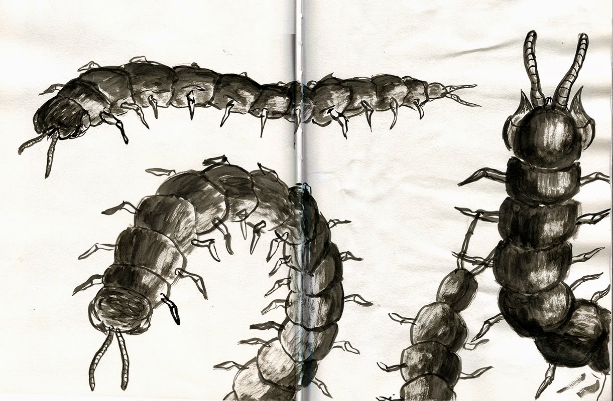
Centipede test

I gotta study centipedes more - how they move etc


Doesn't really look like it's moving due to me not knowing how to draw the legs - just that it's dragging along

Sunday, 16 November 2014

Moving Pictures storyboard and initial ideas

Rough storyboard for my hand drawn animation - I'm figuring that I can make this last 30 seconds. I don't particularly want to make it that much longer considering how intricately I want to draw it.


Sketches showing the sequence of the centipede squeezing the head which will obviously need to be developed, but this shows the general look/nature of the animation.

Similar of Dr Benway - one drawing of him facing in front, the initial one of him from behind and an intermediate.


Saturday, 15 November 2014

Printed Pictures thumbnailing

Thumbnails for the thematic prints I intend to make alongside the character portrait prints, incorporating the black meat and the gross limbs.


Really like the idea of the centipede having parts of its body out of frame - seems claustrophobic and uncomfortable. Also thinking I should keep the arm and leg in one print rather than squeezing 2 prints out of them like I sketched out here


Thursday, 13 November 2014

Responsive- Scott Pilgrim


WAHEEY

"The black meat"

"Traffickers in the Black Meat, flesh of the giant black centipede - sometimes attaining the length of six feet - found in a lane of black rocks and iridescent, brown lagoons, exibit paralyzed crustaceans in camoflage pockets of the Plaza visible only to the Meat Eaters."

In "Naked Lunch", the black meat is used as an alternative to drugs, specifically heroin. This is an interesting piece of imagery that I have explored and expanded upon in my visual journal


I like the image of the centipede squeezing the head as a sort of metaphorical comment on the hold of drug addiction

Wednesday, 12 November 2014

Project Proposals revised OUIL504

STUDIO BRIEF 2 PROJECT PROPOSAL: Moving Pictures

I intend to produce:
A 30 second hand-drawn animation that will act as a kind of trailer for Naked Lunch.

The content will focus on (identify 3 specific themes, texts or concepts)
1. The concept of “The Black Meat” – a type of drug that is made from the flesh of giant black centipedes and taken as a replacement for heroin.
2.The character of Doctor Benway, who is a sadistic doctor that treats his patients with no respect.
3.The grotesque nature of the book’s handling of drug addiction

I will be aiming to communicate (identify 3 specific messages, ideas, moods etc.)

1.  The grotesqueness of the book’s writing and events
2. The wildness of Burroughs’ head through a messy visual aesthetic
3. The insanity behind the characters – particularly Benway through the way he is animated – movements, mannerisms, etc.

To an audience of ….. (name 3 characteristics)
1. Readers of Naked Lunch
2. Older viewers
3. Those interested in surreal/disturbing animation

More play

Lino cut of a character - turned out really well. Limitations of the medium made for an interesting aesthetic - rough around the edges and sharp angles and lines. Worth pursuing maybe


Little digital thing as I begin to consider screen print as a back up

Monday, 10 November 2014

Etching/Monoprint workshop


I was surprised at the quality of the monoprints I did above. I struck a good balance of intentional line work and the accidental nature of the process with the first head on the left. The others were less successful as detail/linework began to get fuzzy and lost, but it definitely opened up my eyes to the potential of monoprint.


Although I love etching, I was quite disappointed by how it turned out when I tried it. Considering the amount of time it takes to produce one etching I was not satisfied with how they came out. The reason could be that my design with the lines was too complex to do as a taster etching, I may not have scratched into the copper deep enough, or I may not have left the copper plate in the acid for long enough. 
At any rate I will either try again with a simpler design, or I will begin to consider how I can fall back on screen printing.

Sunday, 9 November 2014

Responsive- Picking a brief

http://www.ycn.org/awards/ycn-student-awards/2014-15-ycn-student-awards/briefs/syfy-uk
"Syfy UK

Get the sci-fi audience to love the Syfy brand for being the most passionate home for sci-fi"

What is the problem the brief is identifying?
No one is watching the channel and they are seen as irrelevant

What is the brief asking you to do about it?
Get sci-fi fans to love the brand for what it is, despite not always having all the best content on TV

What is the brief trying to achieve?
Convince their audience that Syfy is the "natural and passionate home for sci-fi"

What is the message?
That Syfy is the "natural and passionate home for sci-fi"

Who are the audience?
18-25 year old sci-fi fans


How will the message be delivered?
Open brief - message can be a format of my choosing, promos, digital products, campaign, etc.

Who will benefit?
Syfy channel

Can you foresee any problems?
Identifying an aesthetic that will appeal to such a specific audience - this will require research

What do we want out of the Responsive module?

Main points I gathered from this session:
  • How to break down a brief into its real problems and questions (The brand is boring, the brand is behind the times, the brand doesn't know who they are etc.). Also, whether it's asking for a product, a visual concept or a pitch
  • This module is great for building up a portfolio of finished, refined, commercial work
  • Competitions over live briefs have benefits such as solid deadlines, lack of client interaction and are confidence boosting
It was also interesting to be given a suggestion to avoid illustration-centric briefs such as the MacMillan Alice one since it would obviously bring with it the largest and stiffest competition of all briefs.


Friday, 7 November 2014

Drawn Animation - The Man With the Talking Asshole


This turned out so much better than I was expecting. The addition of a few extra frames on his eyes to get an "establishing shot" was a great idea Eleanor suggested to me. This makes me feel a bit better about doing more animation though I still worry about how long it takes. I want to colour this in but I don't know if it's a realistic goal with the time I have.

Tuesday, 4 November 2014

Themes for etching

An idea of another etching I could do that tries to communicate a theme of the book - I'm showing a gross looking arm and leg with injection scars/marks


Been looking at Phillip Dvorak's work which I love - he works into his etchings with watercolour and gouache. Quick digital colour experiment:


Printing it out on cartridge paper to work into with gouache:

I think these turned out well. The printer in the studio is weird and makes the ink behave funny when printed so the background didn't work too well on the left one which is all gouache. Marker pen worked much better for the background as seen in the right version.


Characters for etching

Quite a while ago I did this collage portrait of a character called Willy from "Naked Lunch" for my visual journal. When I decided I might want to do etched portraits I went back to it and developed it into a line drawing appropriate for etching:

Then realised this was a good way to inspire the chaotic nature/proportions/mood through to etching and did some of other characters


some drawings of Dr Benway in repsonse to my collage:
This is proving to be a fun way of informing my line drawing