Wednesday, 30 April 2014

OUIL406 End of module eval.


1.  What skills have you developed through this brief and how effectively do you think you have applied them?
I think what I have taken the most out of this module was the discipline of working to very specific formats and through specific methods. This was most evident in studio brief 3 in which we had to produce three different sets and I feel that each of my outcomes worked in their specific format quite well, although the small scale of the stamps is still something that stumped me, with such small scales definitely being harder to design for.
Although I already knew the basics of Illustrator coming into this module, I have definitely developed my skills in using it – being more efficient with my use of its tools and making image through shape which I hope will influence some of my other work done through other means.
In the group project I made a club leaflet with Illustrator as well out of both line and shape. This was more in vein with how I traditionally work, but the experience was good nonetheless and the leaflet came out well.


2. What approaches to/methods of image making have you developed and how have they informed your concept development process?
In the cities postcard brief, knowing that I would be using Illustrator, and that I wanted to make image through shape, I found myself working in my sketchbook with sharpie markers and making coloured shape blocks with them, so that I could get a better idea of the process with which the final outcomes would be made and how I could potentially construct them when it came to it.
I think with studio brief 3 I also developed an ability to think about how I could re-appropriate imagery I’ve already created for different formats – Each set shares something with another – either the Alice character portraits, the backgrounds, or the sketchy pencil texture. This re-appropriation of elements could be an interesting skill to develop and good time-saver.


3. What strengths can you identify in your work and how have/will you capitalise on these?
I think the variation of approaches to my creation of work this module is a strength. I’ve developed a lot of skills across a breadth of media this module, which makes me feel confident that I could capitalize on these new skills in the future. I think I used shape intelligently for the post cards brief. This has made me more eager to incorporate it into my other work, which is a sentiment I felt by the end of visual language as well. I think this is an area that I really need to devote time into exploring and experimenting with in my image making process.


4. What weaknesses can you identify in your work and how will you address these in the future?
I think the weakest things I have produced this module were the stamps for the final brief. I think a key thing I need to work on is just try and be a bit more open-ended with what I produce; perhaps I relied too much on my re-appropriation of other elements because I didn’t want to spend more time developing separate images for the stamps. Maybe I should have done a bit more research into interesting types of stamps .


5. Identify five things that you will do differently next time and what do you expect to gain from doing these?
·      Each project probably could have used more research in order to better inform how each outcome was composed – i.e. stamps
·      When working in a group project, put more consideration into the subject matter and how well we can collectively respond to it in a group. This will speed things along much more nicely and make decision making easier both individually and as a group.
·      I will invest more time in going back and improving things done early on in the module that could use tweaking – The first post card I made of the Louvre is much weaker than the rest. If I had left myself time at the end to fix it, the set would be a lot nicer.
·      I will not try and create a traditionally drawn look digitally like I did with my SB3 poster. Drawing all the little lines to create tone must’ve taken well over 8 hours and was not fun. I only just realized how much easier and quicker it would’ve been to draw it out in A4 and scan at a higher resolution as I have done for COP more recently.


6.How would you grade yourself on the following areas:
(please indicate using an ‘x’) 

5= excellent, 4 = very good, 3 = good, 2 = average, 1 = poor

1
2
3
4
5
Attendance


x
Punctuality


x
Motivation


x

Commitment


x

Quantity of work produced


x


Quality of work produced


x

Contribution to the group


x


Monday, 28 April 2014

Final Resolutions

A2 Poster:
I am fairly pleased with how this has turned out. The process in which I drew all the  pencil marks digitally was incredibly time consuming however, and is not something I would like to do again. 
It would've been easier to do it by hand and then scan/colour the scene in, but I did it as an experiment and by the time I realized it would work, I had done enough of the poster to make starting again traditionally pointless. 
  • The decision to remove the 4 figures in favour of having Carroll on the boat in the distance was a good decision. The image has much more subtlety now and is more harmonious. 
  • This addition has made me realize however that the bridge is too large. I've scaled the boat with the rest of the image with this in mind- I may as well leave the bridge to be disproportionate on its own rather than bringing the boat down with it.


Postcards:
  • I think the postcards are simple enough and of a charming concept to work. 
  • I think re-using a section of the poster for the background was a good idea to save time. It's a shame that I had to use the same section for all the postcards, but I didn't feel that the background had enough different areas that worked well as backgrounds for me to make each one unique. 
  • Keeping the character cards blank as opposed to colouring them in was also a good idea as they have more impact and charm in this form.

Stamps:

  • I struggled with the stamps. I wasn't sure how to design for such a small format and then finding a way to make my chosen visual style work with it was even harder.
  • I considered leaving them blank like the character cards but this felt incomplete.
  • I think using the pencil like marks for the background is reminiscent enough of the other sets though and helps to hold it together.

Dodo colour

For the stamp, I had to change the colour of the Dodo from the right version to the left as I thought the tones were too similar to the ones I was already using for the Cheshire Cat.

Sunday, 27 April 2014

Poster


A more complete version of the poster in which I have created a scene on an Oxford river, where Carroll often went rowing. I realized after a tutorial that it might be pointless to have the figures display here since they will be shown on the post cards in full. 
I might put a small figure walking down the path or a rowing boat far in the distance:


Post card thumbs

My idea for the post cards is an extension of the poster - Each character holding their card over their face while on the boat, looking from in front with a similar background. I also thought about doing them simply on a similar background on land or a river bank, but I think having the boat ties it all together more.


Digital tests with positioning:

I think the final one is best - The composition feels awkward when the boat is cut off at the bottom and the boat is much too small in the first one as well.


Tried colouring in the character cards but not sure it works as well as they do when plain line art. They definitely don't stand out as much.

Sunday, 20 April 2014

OUIL404 Visual Language End of Module Evaluation

1.  Which practical skills and methodologies have you developed within this module and how effectively do you think you are employing them within your own practice?

In terms of expanding my image making process, I think that looking at shape in depth has been great. I am most comfortable and adept at using line to make images, so this introduced a whole new way to work. I am now a lot more interested in using shape to build images, but also really want to find a way to incorporate it with my line work. I have done so a little bit with one of my iguana images, which features a wash of brusho with minimal line work for definition. I think this sort of simple application has a lot of potential I could tap into. 

2. Which principles/ theories of image making have you found most valuable during this module and how effectively do you think you are employing these within your own practice?

I think in general, this module has been great for improving raw drawing skill. Most importantly I have developed my skills in creating illustrations as opposed to simple drawings – this is in terms of composing and finishing a drawn image. These skills are feeding into the work I produce in my other modules and also personal image making. I feel like I am able to formalize my image making much better than before and even find the extended process of making illustrations enjoyable.

3. What strengths can you identify within your Visual Language submission you capitalise on these?

Looking through studio brief 1 and 2, I’ve noticed that there is a very clear improvement in my ability to compose images. In studio brief 2, all my images are composed and what I would consider illustration, as opposed to studio brief 1 in which hardly any of the images have context. I feel like my thumbnailing and ability to produce roughs in preparation of a final piece is strong. I think in the last two pieces, the headless man and flying car, I nailed line of sight pretty well. I really want to continue developing this skill through reading more Loomis.

4. What areas for development can you identify within your Visual Language submission and how will you address these in the future?

My blog is very black and white in terms of colour. I don’t feel like I do enough colour tests/experimentation. Also I should probably try and use more kinds of media. I think it was good that I completed the flying car completely with watercolour as opposed to going digital and that I used dip pen for the drawing part of the headless man.
I think I need to develop traditional practices to drawing and usage of traditional media rather than relying on digital colouring/drawing techniques. I definitely need to step away from using fine liners and my brush pen. Also I always feel that my general drawing skill can be improved. I still have yet to study Loomis’ “Figure drawing for all it’s worth”.

5. In what way has this module informed how you deconstruct and analyse artwork (whether your own or that of contemporary practitioners)?

I now tend to look at an image and think about it in terms of whether it uses shape or line primarily, or a combination of both. When I find such images, I find it easier to pick out what I like about it, what inspires me and how I can potentially apply it to my own practice.
I also try to consciously identify a line of sight and pick apart what it is that gives the image that direction. After having drawn an image myself, I often try to identify where I have used such methodologies myself and how successful I have been. Sometimes I try to come back to an image a while after having done it and see what sort of impact it has after I’ve forgotten about all the conscious decisions I made while drawing it. I think this has given me a much more objective view on my work, making it easier to evaluate and improve upon. 


Friday, 18 April 2014

Poster mock ups/tests

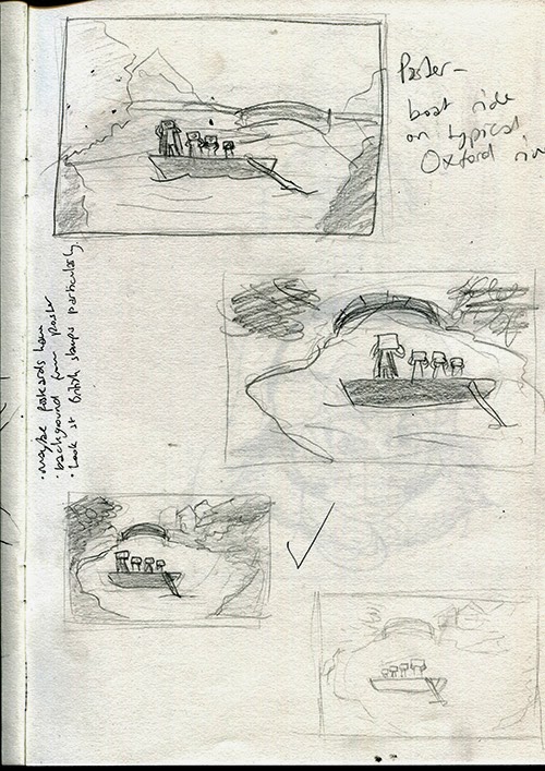
Thumbnails for the poster - I want to try and get some line of sight in the shapes and bordering elements. The third one down was suggested to be the strongest in a peer feedback session. I think this is because of the way the land nicely borders the water and the boat in it.


Quick mock up of what the poster might look like using the same faux pencil brush. I want to use it for the background as well.

And a more accurate version with a more considered composition based on the thumbnails:


Testing line quality

These are the completed figures, each holding their own character card. I was thinking about the visual style that the illustrations could take (thinking about the A1 poster) and decided to play with line quality. These are the original lines done with pen scanned in:

And these are redrawn using a PS brush that mimics pencil lines:

I think the faux pencil lines work nicely and are better for the aesthetic and playful nature of the figures/illustration. I think the simplicity of the character cards being just line drawings on an off white background helps to make them stand out and adds significance.