Tuesday, 5 November 2013

Studio Brief 3 final pieces


These are the 3 final pieces for the "Day in the Life" brief.

Feedback/evaluation sheets:


  • I'm pleased with the use of a light gouache wash and the controlled darker lines, creates nice contrast and bold images
  • Pleased with the composition of the landscape one in particular, I think it is the best consideration of format
  • Backgrounds could perhaps have been developed in some way, feels a bit simplistic/plain.
  • Wheels on the pram should have been refined 


Photoshop brief cont.


Here's a second image from the A5 series processed through Photoshop. I placed a newspaper texture on the bottle, similar to what I had done for the physical piece because I feel it worked really well there. 
The messy background texture is from a mono print I made at a workshop.
I experimented with the composition by making the image with and without black bars on the edges


Progression of the image with the black borders


Progression of another A5 piece.


Photoshop Brief cont.


This is a coloured version of one of the scanned A5 pieces coloured in. Since it is quite a simple drawing I decided to use simple flat colours, plus a newspaper overlay to make the cassette tape pop out a bit more.


In this version, I decided to maybe add an overlaid newspaper towards the bottom of the image to help make the image more interesting or full and help add to the messy nature of the tangled tape at the bottom of the image.


Another version with a colourful background which I don't think worked well at all and clashed with the image of the cassette tape

Photoshop Brief


These are the 5 A5 images that I will be working from for the Photoshop brief. These images are from the large thumbnail sheets that were used to develop ideas for the first visual skills studio brief. These images show them having already been adjusted and tidied up in Photoshop using levels and curves adjustment.

Wednesday, 30 October 2013

Studio Brief 3 cont.


A few more developed ideas, I think the most significant thing in these sketches is the development of the portrait illustration, which began as a double helix with a boyfriend in each gap getting progressively worse. However, this then developed into a single bad boyfriend being wrapped around a double helix which I think is more visually interesting.

Visual Language Study Task 3 - Monoprints


For the monoprint induction, I decided to expand on the visual language task and do some monoprints of Lonesome George. I found monoprinting to be a lot of fun and the results produced to be quite interesting. I really liked the unpredictability of the process and ended up with some nice images. 

Above are three of the most successful images - The red tortoise one is probably my favourite, as the blue ink from the previous print had left its colour behind on the background, giving me a two colour print.

Below is a really quick print I did in order to test out getting two colours on a print purposefully. Given more time, I would like to continue to experiment with layering the colours on top of each other to produce more interesting work


Monday, 28 October 2013

Visual Language Study Task 3 - Line and Mark


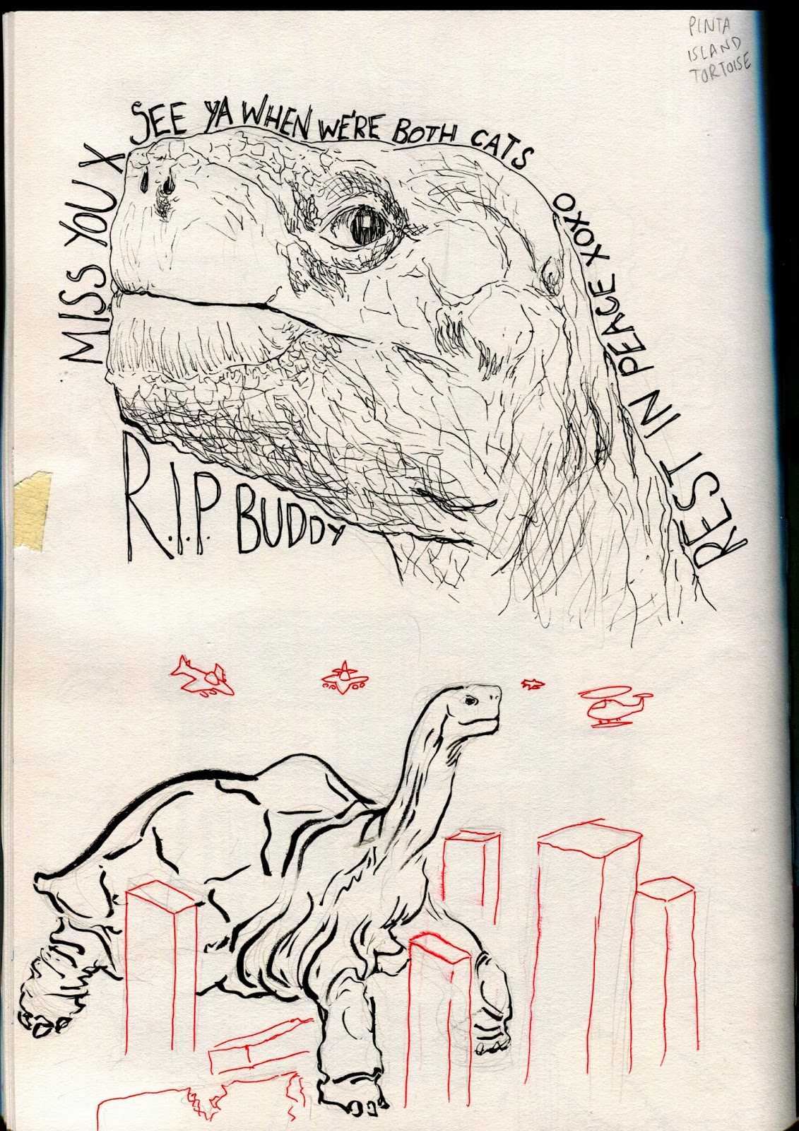
For the third visual language study task, I have chosen the subject of the Galapagos Islands. 
Here are some drawings of Lonesome George I've done in response to the subject. I've tried to use different media in different ways, but all focusing on line and mark making. 

For the red ink drawings, I tried to be a lot more loose about them, deciding to go straight in with the ink rather than drawing in pencil first. I feel that these images have a nice fluidity about them which works well with the media. 
The more controlled drawing in which I inked everything except for the lines of the tortoises also turned out quite well and is probably an approach that would be worth trying again in order to get an even more successful and tidier outcome.


Some more experiments with line and mark, I think that using a flat edged brush worked well for the gouache drawings and gave them a very quick but tidy finish with the straight lines.

The dotty drawings also turned out well but were quite time consuming.


Photoshop progression


I found layer masks extremely useful for adding texture to my drawing, and so I used them for the feathers, sweatshirt and hat.
While it made adding texture very efficient, I feel that too much texture on an image such as this produces a very "cheap" feel, and is not particularly aesthetically pleasing, but I decided I would incorporate them into the image as much as possible in order to learn how to use masks well

Studio Brief 3 Development(cont.)


A couple pages in my sketchbook showing how I am developing this brief. I am not necessarily working to the formats I will have to for the final piece on these pages, as they are more to experiment with how the illustrations will look/what sort of media or style they will take.

STUDIO BRIEF 3 - A Day in the life


These are some initial rough sheets of ideas I whipped up in response to the article "Evolution and Bad Boyfriends. I'm deciding to focus on the aspect of the article which talks about how women are becoming more and more dependant on their parents for support and resources as they evolve to choose less supportive partners, and also the aspect which talks about how women are willingly choosing the "worse" boyfriends.

Peer feedback sheets:


Self-evaluation sheet from the peer feedback session