Monday, 29 February 2016

Otherworlds exhibition

I went to the Natural History Museum's 'Otherworlds' exhibition on the weekend. It was a collection of Michael Benson's recent images of the solar system.

The exhibition was really useful in providing interesting information that could potentially go into my book, as well as being a showcase of some really amazing images of the solar system.


I also got my hands on a really good book with loads of information on the planets - I've begun to take research notes and will start cross-referencing info in order to find the most suitable/interesting bits to hold onto.

Orion Publishing Mock-ups

I have mocked up the concept for the varying dust jackets for the book cover and also shown it standalone:


I want to actually produce the jacket by printing onto acetate, but I don't know how I would make a dummy of the book itself to apply it to. It might not be necessary.

Potential boards for submission:

Friday, 26 February 2016

Orion Publishing competition pt.3


Third image finished. I had a tutorial with Patrick and he suggested to extend the brief I should apply the illustrations to a book jacket and maybe experiment with transparencies. To take advantage of this idea, I have created another version of the image with all the variables cleared to leave only the background.

Thursday, 25 February 2016

Painting planets

I took Patrick's advice from the latest tutorial to get out of the sketchbook and start working bigger in order to better represent the scale and immensity of the planets. This was valuable advice and I feel it has really pushed my image making for this project forward. I'm working at A2+

I decided it might be best to try and be a bit more expressive with the way I represent the planets - I painted each of these multiple times in order to get a good balance of representation and expression.
I want the paintings to say a bit more about the planets' personalities. I'm doing this with the gas giant Jupiter by having the belts spray off the sides a bit, and the ice giants Uranus and Neptune by giving them a cold air around them.

Earth is going to be a challenging planet to depict.


Iceland similarities to Mars

Wednesday, 24 February 2016

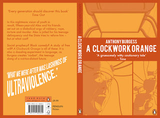
A Clockwork Orange - Final Submission

I put together the advice I got from Ben and Patrick this week, made some tweaks and am now ready to submit my entry for the Penguin Random House Design Award:

Patrick suggested I tweak some of the type on the back cover so that it looks a little neater and presentable. I feel like the difference it has made is insane:

Anyway, I've been pouring over this brief for weeks now since I really am in it to win it - if I could keep on making book covers for the rest of my life I would be incredibly satisfied with my practice. I think that I've approached this brief in a much more intelligent way than I did last year and from the start to end my eye for direction has improved through the rigorous distillation of the image into simpler and simpler forms - looking back at my initial idea I see the flaws with its overbearing design more and more. Watching Chip Kidd's TED talk was definitely a massive inspiration to reaching my final solution.

With this new knowledge, I imagine that, with a simplified design, screen printing a book cover could still potentially be a really interesting and viable solution to finishing one. Maybe in the future.

Tuesday, 23 February 2016

Tom Clohosy cole reply

Tom Clohosy Cole replied to my question about his audience with Space Race:

I didn't really spend much time considering the audience, I focused on getting the facts correct and making it something enjoyable for me to work on visually. I think the rest often follows and it will always end up suiting the right audience for your style of work. I tend to think about audience more when making a children's book, as they tend to have to conform to certain parameters, but with the Nobrow concertina I just did something I hoped me or my peers would enjoy. I wouldn't worry about the middle ground too much, it's often a good place to sit your work as it can appeal to a wider range of people. 

Similar advice to what Nicolas Andre e-mailed me about and what Fred said I should begin to think at the last group tutorial. I particularly like his advice to make something that me or my peers would enjoy.  I think this is the best way to get a satisfying end result to the project.

Astronomical - drawing planets

I've been doing a lot of sketch booking for my solar system book as I want to get the look of the images just right.


In the last image, I feel as though I am beginning to really hone in on what the planets will look like - the planets with the red X's by them are the ones I feel most happy with.

Monday, 22 February 2016

Shutterstock 2/3 images designed

I haven't begun the final image since I want to take some good reference material beforehand in order to make the image as tight as possible. I have finished the first two designs and they can be screen printed whenever now. I'm particularly pleased with the first one.


I'm not sure how well they work as a set so far, but maybe the third image will help out in this regard.

Saturday, 20 February 2016

Shutterstock two colours

Instead of doing a three colour print, I thought it would be more economical and interesting to just do two instead; red and blue and then use the overlap to create a third:

I'm liking the colour balance on this. I think it will make for a more universally suitable colour palette across the three images as well.


One more Clockwork test


This is getting silly but I did this and thought it looked interesting - Probably not interesting enough to consider entering, but was worth seeing whether I could pull together all the elements I have made for the brief so far.

I watched Chip Kidd's TED talks on book cover design and took note of his comments on 'words and forms' for his Dietrich and Hepburn book covers around 4:20. Really deceptively simple stuff.

This brief has definitely taught me to simplify the work that I make, especially if it's going to go on a book cover. The way I've been trying to make typographic elements work around a pre-made image hasn't been very smart and I'll avoid clinging onto one image so desperately in future.

Friday, 19 February 2016

Shutterstock initial thumbs

I have my ideas for the three images -
-Image 1 will illustrate 'the journey' stage of The Quest plot.
-Image 2 will illustrate 'under the shadow' of The Comedy plot
-Image 3 will illustrate the 'thrilling escape and return' of The Voyage and Return plot.

Image 1:


Image 2:

I like the idea of them being all in a long format, or at least something not A-format. I also like the idea of turning them into 3-colour screen prints as this is a skill I'm pushing in my university career. This makes the images more personal to me.

Orion Publishing competition pt. 2


I've now finished the second image of the triptych for the Orion Publishing competition. I think the head of the man looks a little funny in the second image, but when viewed in conjunction with the first image I think they are quite strong. 

I'm really enjoying working with this image because I feel as though my use of light and shadow is working well. Should definitely incorporate it into more of my work. It's also proving to be good practice for my figure drawing, and how these figures relate to the environment they are in.

Thursday, 18 February 2016

Clockwork continued

I developed the design featuring the screen on the back cover, and while I think it makes for a nice back on its own, the entire wrap around doesn't really work.

I decided to go back to thumb nailing for the whole spread and decided including the chair Alex is strapped to on the back might be a nice way to get to disconnected illustrations to relate:

When I tried to arrange the chair on the back like in the thumbnails, the composition still didn't work. I put the chair on the front though and thought it looked good:

Less is more.
This also allowed me to maintain the original typographic layout for the back cover. Even though I really like the portrait I drew, I think I'll have to put it away for something else. Will take a short break from this project but keep trying to refine it.


D&AD Shutterstock brief initial research

For the Shutterstock brief, entrants are asked to illustrate three of the "seven basic plots" outlined in Christopher Booker's book of the same name. The three that resonated the most with me were:
-The Quest
-Comedy
-Voyage and return

At the D&AD briefing a couple months ago the talkers commented on the importance of telling a story with your work - looking for meaning, messages, hopes and fears. I want to keep the story simple but relevant to me, my peers and anyone else that may find interest in the work.

Immediately the most relevant story to me was the story of university - I want to see if it's possible to distill this story into three images that people will relate to.

I did research into the general theory of Booker's book and one key detail was that there is only ever one character of primary concern: s/he is with who we identify. s/he develops gradually - everyone else is only a representation of some aspect of the hero's inner state. The character must be identifiable.

I then did research into the three plots above and how they have been broken down. In italics is how these can be related back to the university story.

The Quest:
-Set-up: Hero must leave their everyday life to search for an object, location or information.

-The Call: Hero finds it impossible to remain at home - there is a 'visionary direction' explaining where
to go, how to get there, etc. There's a 'distant life-renewing goal'
A letter comes from a university in a new city. The letter or a self-printed map contains visionary direction where to go and how to get there.

-The Journey: Various obstacles will be overcome by the hero over hostile terrain.
Student will carry a large portfolio through treacherous winter weather, on public transport and in a new city.

-Arrival and frustration: Hero is within sight of the goal but now has a series of obstacles to overcome.
Student arrives at university, but must now have a portfolio review and interview

-Final ordeals: A final series of tests
The student must wait a period of time before knowing the outcome of the interview

-The Goal: Hero has won it all - 'an assurance of renewed life stretching infinitely into the future'.
Student has been successful at the interview. Their renewed life comes in the form of a new university life in September

Comedy:
-Set-up: Grand mesh of relationships among a large cast, rooted in miscommunication. There is a fog of misunderstanding maintained by a dark figure.
Student meets various people when arriving at university, perhaps from different areas of the country which can cause miscommunication and differences in how people are understood. Perhaps have disagreeable flatmates.

-Under the shadow: Little world in which people are under the shadow of confusion, uncertainty and frustration and are shut up from one another.
Students are in a lecture theatre, potentially hungover, bored, inattentive, but must remain quiet.

-Tightening the knot: The confusions gets worse until the pressure of darkness is at its most acute and everyone is in a nightmarish tangle.
Student is facing deadlines and is under huge pressure.

-Resolution: Perceptions are changed through previously unrecognised things coming to light. Shadows are dispelled, joyful union.
Deadlines arrive and student hands in on time, celebrates.

Voyage and Return:
-Set-up: Obvious plot for dreams - Hero enters a magical land where normal rules don't apply, explore happily for a while, then encounters a darker side of things, conquers, escapes and returns home more mature than before.

-Anticipation stage: Hero's 'consciousness is in some way restricted', most commonly due to youth or some serious flaw. Could also be a blow to the head - Character awakens in an alternate reality.
Student's life inexperience pre-university. Student finds himself at university living alone for the first time.

-Dream stage/initial fascination: New world is puzzling and unfamiliar, but cool. Hero explores but can never feel at home.
Student is getting used to new freedom, learning to live by themselves and enjoying it.

-Frustration stage: 'Mood of adventure' starts to darken. Options disappear, Hero starting to get hemmed in.
Student faces difficulties of university life such as work and deadlines, balancing social life.

-Nightmare stage: Hero looks doomed
Dissertation

-Thrilling escape and return: When it looks like it's over, Hero makes a dramatic exit back to original world.
Student graduates and finds themselves back at home, now a graduate, more mature.

But question: Was there any character development? Have they been fundamentally changed, was it a dream?
People question university these days. This image could allow for debate.

The plan is to pick one stage from each of the story and then illustrate it.

Tuesday, 16 February 2016

Clockwork continuation


I've been struggling with this a lot but I think I'm getting closer to figuring it out. I want to simplify the design because I think it was all getting a bit too messy. I think it was a good idea to take a break from the project since I feel more willing to go in a completely different direction and make radical changes.

I think more modern type like this is also suitable due to the timeless nature of the story.


I think I'll go forward with this front cover design and incorporate the film screen that Alex is forced to watch on the back. This way there is a thematic and story-relevant link between the content on the front and back covers.

Monday, 15 February 2016

Nicolas Andre reply

Nicolas Andre, the french illustrator I e-mailed replied with a very nice reply about my solar system book:

"For a quick anwser i would say that you're asking yourself the 'wrong question' or you're asking it to early
compare to your work. I mean the studies are made to try eveythings in whatever direction … OF course is very important to keep vigilant and aware of editorial world and bookshops ' rules' , but in my opinion they will comes
in a second time.
So i would recommand to work very hard on your final projet ( and i know what a screenprint leporello means - i've made 3 differents leporelos in 3 colors each, ind 25ex each, 180cm each for my Strasbourg Master degree) … after my degree i went to see Nobrow and my favorite youth books editors to speak about it."

He encouraged me to not worry too much about the audience just yet - that everything will make sense once I have done a sufficient amount of visual research and play. He placed a lot of importance on the idea of doing something personal to me, since I won't get much opportunities to do so after graduating. 

He also said to feel free to show him my book once it's complete - this I definitely won't pass up to get his opinion.

Tuesday, 9 February 2016

Natural History Museum

http://www.nhm.ac.uk/visit/whats-on/programs/nhm/otherworlds%3A_visions_of_our_solar_system.html?date=09.02.2016

Patrick told me about an interesting exhibition of images of the solar system at the Natural History Museum which sounds like it would be worth going to. It has a bunch of large scale photos of the planets along with some information on each one.

 I'll plan a trip to London soon to check it out.

Sunday, 7 February 2016

Finding tips for the Big Kahuna

I've been sending some e-mails in order to get some advice before I tackle my Solar System book.
I e-mailed Tom Clohosy Cole about audience considered when working on a project like Space Race.

I also e-mailed the general info address on the Nobrow website asking a similar question:

I also asked my sister to help me translate an e-mail to send Nicolas Andre asking pretty much the same question:


Tuesday, 2 February 2016

Orion Publishing Competition

This competition brief asks for the entrants to illustrate/adapt a painting that is significant to the themes of the book "The Versions of Us". 
The competition accepts a wide variety of entries, including book covers, but I don't feel confident enough illustrating a cover for a book I only have a paragraph of text for. I'm also already doing the Clockwork Orange cover, so want to mix up what I make a bit.

The painting is described to have quite a strange composition in the book and I'm not too sure how feasible it actually is so I've had to take some creative liberties with the gaze of the man which is supposed to be on both the woman and the viewer.

I re-read some Loomis and tried pretty hard to get the perspective right in order to make a believable scene. I think it's worked out pretty well. The painting described in the book is actually a triptych so I think I'll try and work on the other two panels soon.