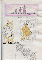
A few more developed ideas, I think the most significant thing in these sketches is the development of the portrait illustration, which began as a double helix with a boyfriend in each gap getting progressively worse. However, this then developed into a single bad boyfriend being wrapped around a double helix which I think is more visually interesting.
Wednesday, 30 October 2013
Visual Language Study Task 3 - Monoprints
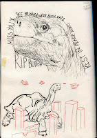
For the monoprint induction, I decided to expand on the visual language task and do some monoprints of Lonesome George. I found monoprinting to be a lot of fun and the results produced to be quite interesting. I really liked the unpredictability of the process and ended up with some nice images.
Above are three of the most successful images - The red tortoise one is probably my favourite, as the blue ink from the previous print had left its colour behind on the background, giving me a two colour print.
Below is a really quick print I did in order to test out getting two colours on a print purposefully. Given more time, I would like to continue to experiment with layering the colours on top of each other to produce more interesting work
Monday, 28 October 2013
Visual Language Study Task 3 - Line and Mark
For the third visual language study task, I have chosen the subject of the Galapagos Islands.
Here are some drawings of Lonesome George I've done in response to the subject. I've tried to use different media in different ways, but all focusing on line and mark making.
For the red ink drawings, I tried to be a lot more loose about them, deciding to go straight in with the ink rather than drawing in pencil first. I feel that these images have a nice fluidity about them which works well with the media.
The more controlled drawing in which I inked everything except for the lines of the tortoises also turned out quite well and is probably an approach that would be worth trying again in order to get an even more successful and tidier outcome.
Some more experiments with line and mark, I think that using a flat edged brush worked well for the gouache drawings and gave them a very quick but tidy finish with the straight lines.
The dotty drawings also turned out well but were quite time consuming.
Photoshop progression
I found layer masks extremely useful for adding texture to my drawing, and so I used them for the feathers, sweatshirt and hat.
While it made adding texture very efficient, I feel that too much texture on an image such as this produces a very "cheap" feel, and is not particularly aesthetically pleasing, but I decided I would incorporate them into the image as much as possible in order to learn how to use masks well
Studio Brief 3 Development(cont.)
STUDIO BRIEF 3 - A Day in the life
These are some initial rough sheets of ideas I whipped up in response to the article "Evolution and Bad Boyfriends. I'm deciding to focus on the aspect of the article which talks about how women are becoming more and more dependant on their parents for support and resources as they evolve to choose less supportive partners, and also the aspect which talks about how women are willingly choosing the "worse" boyfriends.
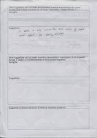
Peer feedback sheets:
Self-evaluation sheet from the peer feedback session
Visual Language Study Task 2
For the second Visual Language session, we were asked to draw the same images from reference multiple times in order to try and experiment with them. These scans show what I consider to be the most successful images that I produced.
For the zombie image, I actually used an image of a normal man in an intimidating pose and used the pose as reference to make a scary zombie
I am particularly pleased with the polaroid camera though as I worked differently to how I normally do for those two, deciding not to use any construction and just going straight in with the pen/watercolour and brush.
Thursday, 24 October 2013
Visual Language Study Task 1
For the first Visual Language session, we were given the brief to simply draw in our sketchbook, whatever we want, with whatever tool we want. I decided to do some observational drawings of my peers, employing slightly different techniques for each. I really enjoyed this task as I had the chance to just draw something I'm interested in - people - and a lot of freedom to do it with.
Sunday, 20 October 2013
Studio Brief 1 Final poster
- In general, I am fairly pleased with how it turned out, but feel that it is not as visually striking as I hoped it would be.
- Pleased that I experimented with collage as opposed to just drawing with pen
- Newspaper however was a good idea for the rest of the bottle.
- Elements of the image should have been larger to remove all the empty space
- Suggested that I vary the width of the cassette tape as it got closer to the bottom of the image
Wednesday, 16 October 2013
Studio Brief 1 Test Posters
This is a test poster done in A2 for the final outcome of this brief.
I think that painting the background black has worked well, the clean lines of the bottle and glasses done with sharpie also helping to make the subject matter quite bold. I plan on doing another test poster to see if I can develop it further
I think that painting the background black has worked well, the clean lines of the bottle and glasses done with sharpie also helping to make the subject matter quite bold. I plan on doing another test poster to see if I can develop it further
Studio Brief 1 Development (Cont.)
Experiments focusing specifically on how I would go about rendering the vodka bottle and shot glasses.
Dry brush , was attractive in the A5 version, but doesn't stand out too well.
Using a marker to shade the bottle is very effective in making the image "pop".
Dry brush , was attractive in the A5 version, but doesn't stand out too well.
Using a marker to shade the bottle is very effective in making the image "pop".
Collaging newspaper was interesting but made the label hard to read. I may try and swap which parts of the bottle are newspaper and which aren't.
The first image is a refined version of one of the thumbnails I did, in which the tape in the cassette links all the shot glasses symmetrically. The cassette works better in newspaper than the label
The second image is a more loose style using quink ink and a dip pen. The idea is that the mess of tape creates the bottle. While this idea may not be communicated across so well, I still think its aesthetically pleasing.
Tuesday, 15 October 2013
Photoshop Induction
In the first Photoshop induction workshop, we were taught how to properly scan an image and optimise it for editing on Photoshop. This began with a stock watercolour illustration which we enhanced using tools such as the Spot Healing Brush, Crop Took and the Levels window.
We were then asked to do the same for our personally scanned in images:
Before and After
This is the image that I scanned in and optimised, by cleaning up all the specks of dirt and bleeding through the paper. I also used the levels to make all the dark greys black and the off white/yellow white.
Friday, 11 October 2013
Studio Brief 1 Development (cont.)
These are my 5 favourite thumbnails, blown up to A5 to help me make a more informed decision about which idea and media I take and develop into a large final piece
When placed into a small crit group, the general consensus was that the tape and vodka images were the strongest of the 5. It was suggested that I try and combine the cassette and vodka somehow, or maybe try and do more with the tape at the bottom of the cassette image.
Here are some thumbnails of potential compositional ideas, including updated ideas which incorporate both the tape and the vodka bottle and play with the shape of the vodka label
Studio Brief 1 Development sheets
The initials of my partner were "R.R", but in order to make the brief more interesting, I opted to use the initials of her first name and middle name instead, so I ended up with the letters "R.H".
Coming up with small ideas for a recurring theme is not the way I work, especially when asked to do so in such a large number, therefore I found this difficult
It became a lot easier when I stopped trying to come up with designs based around the letters themselves, but rather come up with ideas for how I could incorporate the letters into an image
Saturday, 5 October 2013
Summer 10 extended final otucome
This is the final A2 poster I produced for the extended Summer 10 brief, featuring 10 animals with strange/unconventional prosthetics. Overall, I am quite pleased with the result, but there are several things which I was not able to achieve:
Haliaeetus Kitus (Eagle)
Felis Rocketus (Cat)
Scissoris Ciconiidae (Stork)
Instrumentas Rhinocerotoidea (Rhino)
Solaris Elapidae (Cobra)
Canis Bicyclus (Dog)
Vacuumus Elephantidae (Elephant)
Spring-loaded Macropus (Kangaroo)
M-"axe"-imus Delphinidae (Dolphin)
Chelonioidea Cavalcader (Turtle)
Scanned Version:
Thursday, 3 October 2013
Summer 10 extended work
This is the initial A1 poster of ideas that began this project. At first I chose to extend the burrito illustration of my summer assignment, and came up with some ideas that extended from burritos, but then I became much more interested in the idea of strange prosthetics, after the elephant with a prosthetic leg illustration I had done for the summer assignment.
These are scans of some of the pages from my sketchbook work leading up to the outcome of the extended Summer 10 brief in which we must produce an illustrated poster of 10 more things that stem from one of our previous illustrations. I am expanding on the idea of animals with prosthetic limbs, making humorous images of animals with unexpected or unconventional prosthetics, such as an elephant with a hoover for a trunk.
These pages display the different approaches I've had to drawing/colouring my images. I am also planning on re-considering the cannon prosthetic on the turtle as I was suggested to perhaps try and find something that more appropriately subverts the expectations set out by a turtle.
This is the rough pencil version of the final poster, which I will trace over in pen to achieve the clean look which I am going for
Subscribe to:
Comments (Atom)


.jpeg)


