Friday, 28 March 2014

Figure and object

I wanted to do something surreal for my composition involving a disembodied head so Magritte's paintings came to mind:
 
Reversal of objects and figures was interesting but I wanted to see how I could add more of a story so removed the apple. Also considered a lab setting and did a thumbnail sketch of that. 
Someone said a human head wasn't enough of an object so I changed it to a skull and now thought it looked more gothic so thumbnailed a castle interior. This inspired me to look at Harry Clarke and go for a similar dark aesthetic.
Thumbnails also considering value and line of sight. The bottom thumbnail on the second page is strongest in terms of line of sight and use of value to create contrast:
The reverse of values in the shirt and background and trousers and floor is also effective in making the figure stand out more.


OUIL406 STUDIO BRIEF 3 - Persons of Note

Of Lewis Carroll, Steven Spielberg and Harper Lee, I chose to work with Lewis Carroll.
Key research notes:

  • Author of Alice's Adventures in Wonderland - came up with the story on one of his regular rowing trips with the daughters of the Liddell family - Alice, Edith and Lorina
  • Was incredibly self-conscious of his stutter, which he had for all his life
  • Lewis Carroll was a pseudonym - real name Charles Lutwidge Dodgson
  • His hair was a bit like Princess Leia's:

Friday, 21 March 2014

Central Library (UNAM)

Due to the complexity of the design on UNAM itself, I felt it would be best to simply live trace it and construct the rest of the building myself separately.

When I first began building the postcard's shapes, I thought about depicting UNAM in a perspective as though you are looking up at it in order to make the simple square shape more interesting, but in the end decided against it.

By having it as a front-on perspective the building is more consistent with the others in my series.

I think that the intensity of detail on the building makes for a good contrast with my solid blocks of coloured shapes and was a good alternative to trying to simplify the design myself. 

I think the added perspective on the wall in front also helps to really ground the image and make it 3D as an alternative to the whole building in perspective.

OVERALL FEEDBACK/EVALUATION OF POSTCARDS:

  • I think the whole series reflects increase/development of skill in terms of creating interesting shapes/compositions and application of texture/shadow
  • The Louvre is obviously the weakest of the set as I was still trying to find out how to best depict my structures and had a lot of difficulty constructing the pyramid of the Louvre in Illustrator.
  • UNAM, which was the last postcard I did was considered strongest in the group feedback session. I think this is due to my more carefully considered/subtle application of shadow and texture.
  • The Yokohama Landmark Tower was considered to be out of place due to it being done in nighttime. I think maybe if I had done one other at night, it would have balanced them out.
  • I'm pleased that I decided to use Illustrator for shape rather than line - this whole brief I thought about constructing the image in a way that I would struggle with traditionally - I feel that I used Illustrator in a way that made use of what it had to offer in regards to process and finish.

Transport

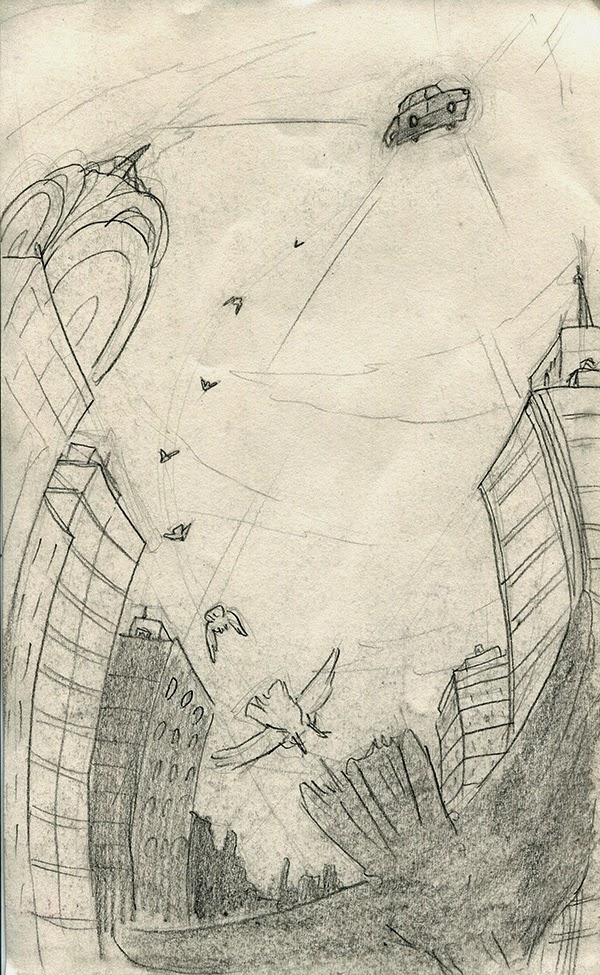
Idea: Something fantastical. Here are a couple thumbnails of a man with a jet pack and then some other less interesting ideas and then a flying car.

Liked the flying car, so I developed it some more and picked a composition which I felt had obvious, but strong line of sight, achieved with the flying birds. The bending buildings also are helping to direct the viewer to the car.

Preparatory sketch along with watercolour practice to test tone/colours, as I want this brief to be resolved through traditional means, simply because I haven't finished a piece of illustration traditionally in a long time. 

Redrawn prep sketch after looking at more reference, particularly what a bird looks like in flight from behind.

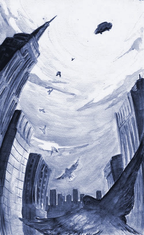
Final illustration: I'm happy with composition but the colours turned out very muddy. In my head I imagined the image with bold, bright colours. I need to practice more with watercolours and should've seen this after the first watercolour test. 

Using watercolour paper gave a nice texture though and that bird in the foreground was well painted.

Also I should've pushed the values a lot more to emphasise the sunny day but I think I was too scared as watercolour is such an unforgiving medium.

I also forgot it was supposed to be a monochromatic image so I rectified this in Photoshop and think the image looks a bit nicer, as I was also able to push the values through levelling.


Sunday, 16 March 2014

Yokohama Landmark Tower

Thumbnails of this beauty of a building:

I also did a couple of sketches of the Mode Gakuen Tower, one of which can be seen on these pages. I decided to go straight for the Yokohama Tower though, because it looks cooler and I have already done one structure with a criss-crossing design - the Louvre


Test: I want my series of images to be fairly simple so for this I am considering sacrificing accuracy of building depiction in favour for the quality of illustration. 
The lines of windows extend to the corners of the building's face, but I think this makes the image look cluttered, so I think I will simply exclude them.


Developed to the same level as the other post cards, however after completing it to this stage I felt that maybe my postcards were getting a bit monotonous, so I decided to experiment a bit more....


and change the scene to night to vary my series of postcards a bit. I then furthered it by changing the colours of all the elements in order to reflect the change in light, making them more bluey and turning the window lights on. 


Final version with texture for shading. Really pleased with the outcome of this one in terms of colour palette and use of shape to construct the building and give an illusion of depth.


Friday, 14 March 2014

Mitad del Mundo

Based on previously posted thumbnail sketches I chose this composition:

I think this composition is extremely strong - very central but appropriate considering this is an illustration of the centre line of the earth. The structure also works well in portrait format. 
This was reduced to shapes, but required more detail than the Louvre to be recognisable, so has a much more 3D feel to it.

Another compositional test of pushing the structure to the side. I feel this is a lot less interesting than the Louvre one, and also doesn't do the structure much justice. It feels frustrating to look at. Knowing that this compositional idea doesn't work with all my structures, I think I will have to drop it.


I wasn't pleased with how the images were looking so flat despite my efforts to make this structure look 3D, so I investigated with texture on Photshop for the shading (though it's not clear at this resolution that there is texture there).
I think that this makes the image much stronger and more interesting and is something that should be applied to the rest of the postcards:


Definitely makes the Louvre and its background nicer.

Louvre

An attempt at a side view of the Louvre, drawn from scratch on Illustrator - I find it really hard to get the perspective of the lines all correct and arranging the lines evenly, so I decided to trace a photo of the Louvre which had all the line structure things in it:

I'll be basing my illustration on this as it is more precise than what I did by myself.


This is based on one of the thumbnails I did in which you can see the main building of the Louvre behind the pyramid. I have done the Louvre in an incredibly simple shape and style as I don't feel I need to do any more to it to make it recognisable.


Compositional idea two: offset building to the side and shift it to portrait. Works fairly well, need to see if the rest can be position in the same way to good effect before I commit to it.


Removing colour in the building behind to make the Louvre stand out


Georges Pompidou Centre

Taking the side view idea into Illustrator and producing an image of the Pompidou centre: 


Then reviewing my reference image and changing the structures in the background:


I think that the image has turned out well - a side view that flattens the image works well at a postcard format and conveys the building without showing the whole thing. 

However, I'm not sure that the same can be done to such an extent for the other buildings I have chosen to illustrate, so I should probably look at how the Louvre can be expressed as a postcard as well and how the rest of my illustrations will follow suit through simplification:


These pages show the structures I've chosen to illustrate simplified into shapes of block colour and few lines (as well as my thumbnails for the Mitad del Mundo). This is probably the way I should go for the postcards


Thumbaniling - Paris

The first city I've decided to illustrate is Paris - and within the city I really wanted to illustrate the Georges Pompidou Centre or the louvre as opposed to the Eiffel Tower or Notre Dame, etc.


Some studies of the Pompidou centre and a couple potential thumbnail ideas. The two strongest ideas I feel are the two top right thumbnails  - the side view captures what I think is the most iconic part of the building: the outside, pipey escalator. I also have considered limited used of colour, or at least which colours will be dominant in the composition.

Consideration of the Louvre by exploring different potential viewpoints. I think that the side view is strong just as with the Pompidou centre - a simple triangle shape for the Louvre being quite nice.


Tuesday, 4 March 2014

STUDIO BRIEF 2 - Greetings from.....

http://www.cavallini.com/p-postcards-cartepostale.php

Some inspiration post cards

Selected cities:
-Quito, Ecuador
-Paris, France
-Tokyo, Japan
-Mexico City, Mexico