Friday, 28 February 2014

Visual Language - depth in composition

For the depth task of visual language I've decided to draw some hippies from the 60s:

First idea which involves a hippie man walking a dog in a park with two people in the background. I used an image from a 60s source book as reference.

Second idea was a domestic scene involving a couple arguing, and third person peeking in the room behind a door:
Initial sketch of the two main hippies using a source book as reference again, so that I know what they'll look like.

Some thumbnails

I then drew the figures again in slightly different layouts to attempt to get a nice perspective/organisation of the characters, the one on the right being the one I finally decided one.

The final etching. 
Considering how much time we had, I think the etching came out alright, but I think I should have been more exhaustive with my thumbnailing as the composition is still off - the seated woman's position doesn't really make any sense as it is right in front of the door. Unless she's trying to keep the other guy out, there's no way or reason anyone would put a chair in that position in a room.

The etching process was very fun however, and is something I want to do again soon.


Wanted to see how the illustration could be resolved digitally. I think the clean lines and crisp shading are nice together.
However I don't see the point in spending too much time on an image with such flawed composition, so while this experiment was useful and eye opening, this is not worth taking any further/finishing.


Monday, 24 February 2014

Group project eval.


Evaluation as a group:
  • Everyone conributed to the group well in their own way - there was little to no disagreement, making most group sessions productive. Everyone had something different to offer in terms of ideas.
  • Each of us have some sort of hand in the GIF in terms of what appears, how it was made and how the images were taken/composed.
  • Were able to creatively bypass issue of singling one type of person in the GIF
  • Lots of quality control throughout the process due to the multiple people who were looking over each stage at every moment. This led to the constant fine tuning of the GIF and the selection of a strong image for the final poster.


Final poster


As we were not able to include the pissing scene in the GIF, rather than just let the photos go to waste, we decided to use the strongest one for the A2 poster. 
Flyers were photoshopped onto the ground in order to include more of our work in the image. 

I feel this poster compliments the GIF very well, in terms of visual approach and composition. I think the fact that this is in third person as opposed to first person is what makes it more complimentary. 

Friday, 21 February 2014

GIF back and forth final resolution

Did some back and forth editing with the GIF; this is what it looked like after me and Kane fine tuned and adjusted order of frames and etc. 

A previous version that Aggy put together featured the pissing scene but me and Kane decided it didn't work.

Aggy took the GIF again and changed some more things and then I finally took it again and adjusted the timing one last time, final version:


Thursday, 13 February 2014

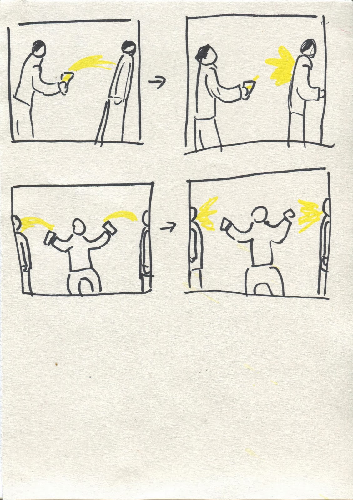
GIF Thumbs


The idea for the GIF side of the project is to depict in 30 frames or less the process of a drunken night out. Above is a flow chart of potential events, and then thumbnails for how to depict each one.
This GIF:

from gifparanoia.org is hugely influential to our project and our approach: We will make things like piss and vomit and blood out of paper and photograph them in creative ways to similar, humorous effect.

Consideration:

  • In order to not offend any type of people, faces should not be shown as this singles out certain groups.
  • The thumbnails above consider using both first and third person perspectives; first person can eliminate this problem and also make the image less personal and more relatable.


This is the puddle and splashes of piss that I made for the project out of tissue.

Wednesday, 12 February 2014

STUDIO BRIEF 1 - That's Pants !!! cont.

These are club flyers that I have collected over the past couple of months in Leeds - I've noticed a lot of them do have some nice illustrated elements on them. 
The "Shapes" one also has a nice repeating pattern on the background which I think gives it a playful look. On one of them, a little speech bubble says "Sometimes too much drink is barely enough". This is the sort of slogan we are looking for!

Having looked at these club flyers for inspiration, our group went ahead and made a couple of our own. Here are mine:


I put on silly comments and slogans that poke fun at the clubbing culture and also made sure to put a notice for how ridiculously cheap the drinks are.
I tried to make them look as 'tacky' as possible to help heighten the satire, and chose to depict a generic drunken face which I feel is unlikely to cause any sort of offence.

Friday, 7 February 2014

Visual Language Composition Task 2

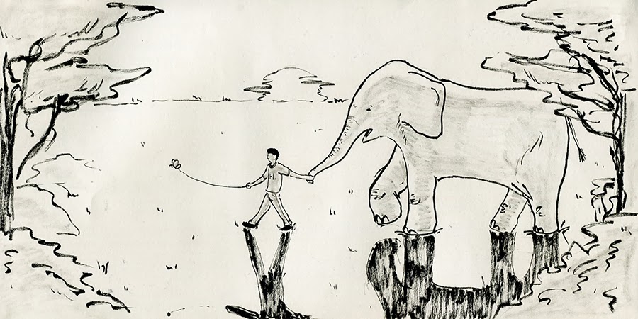
In the next visual language session we were asked to do an illustration featuring a butterfly, an elephant and a person.
The task began with thumbnailing some potential compositions before beginning the final image:


I fell in love with the landscape composition which used a longer format because I feel that it had potential to be a really nice looking image and also using a long format was more interesting than an A paper size.
I began to start refining the thumbnail after I deciding it was my favourite and used brush pen to see if it would inspire further (which it did):
Trying to fix things such as spacing and the horizon line etc.


This is the finished image. While I was drawing it I realised that the image was unbalanced towards the right side as I had accidentally drawn the elephant too far over.
When I noticed this I tried to justify it to myself by saying it creates a sense of travel, with the elephant coming from behind the tree and there being space for them to walk along, but then when I saw the image held from afar I realised it did actually look quite off.

OUIL406: STUDIO BRIEF 1 - That's Pants !!!

For the Visual Communication module we have been asked to come up with ideas about things we find "pants".  
We have been put into groups for the task and this is what we came up with:

This poster was then handed to another group who decided for us which idea we should pursued: they ended up picking club knobheads.
We then had to be more specific in terms of making a plan of what we would research into the theme:

And this is what we came up with.

Tuesday, 4 February 2014

Visual Language composition task

Having been introduced to formal elements of composition, we were tasked with producing 5 thumbnail sketches of varying compositions using the same three objects, and then producing an A5 drawing of the best composition.

I decided to depict a zombie apocalypse scene, with a wrecked car somewhere in the background and a ruined city, so I went and got references to do a couple studies first:

Once I had done several studies I began to thumbnail some ideas in my sketchbook. I read a small section of Loomis' "Creative Illustration" which dealt with composition and tried my hand at his informal subdivision method of composing an image but found it really hard so I simplified my process afterwards:

I think that the far right composition is the strongest because it makes good use of overlapping elements and doesn't feel as uncomfortable to look at as the others due to a simpler view point.


This is the final sketch. I didn't do too much of a background because I think making it too detailed would've detracted from the focus of the image: the zombie emerging from the car. I like the sharp cuts in the composition made by lines such as the bent pole and the street kerb, and also the wavy line made by the smoke.

I think I should have brought the car forward more on to the kerb and touching the pole as it would've brought the elements closer together for a tighter image and also would've just made more sense.