Thursday, 21 November 2013

Visual Language Study Task 4 - Shape and Texture cont.


In these two drawings I applied a thick water wash over the paper before applying watercolour afterwards in order to get a spread watery look over it. In the marine iguana image I thought about how the drawing could work as an illustration and gave it a format box


Another experiment with shape in which I drew a photographer with brush pen and then decided to re-draw him using only shapes of watercolour washes.


Wednesday, 20 November 2013

Visual Language Study Task 4 - Shape and Texture cont.


Finally decided to use digital means to create an image for visual language. I used a tablet to draw out the shapes on Photoshop, although Illustrator probably would've been a more appropriate program to use for the particular look I was going for, though the end result is still the same.

I will probably try and experiment with adding texture on this image a little later

Another experiment where I scanned in a wash of brusho from my sketchbook and then digitally drew an iguana for it fit into:

Probably one of my favourite images I've done using shape. The wash of brusho works so well with the neat and tidy shape of the iguana and the white lines help to define the iguana just enough.


Another attempt at using brusho to create shape and form. I wanted to see how far I could get just with traditional means. It is less aesthetically pleasing than the iguana mixed with digital, but still interesting in its own right.

Sunday, 17 November 2013

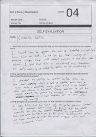
End of module self evaluation

I think a key skill that I have developed throughout this module, and particularly this latest brief, is the ability to persevere with a single idea, developing it, and making it the best idea I can before executing the final resolution. I think this perseverance shows through the experimentation I did in Studio Brief 4 in which I progressed through several ideas and tests before going ahead with my final three illustrations. Though I may not have produced my best work by the end of the brief, the whole process to get there was a valuable experience, and I feel as though each brief I’ve been set has been a similar story.

The varied nature of the briefs has given me an opportunity to try out a fairly wide range of media. This experimentation has led to me becoming more considerate of the scale/aesthetic of my developed work in relation to media. With the exception of studio brief 3, each of my final resolutions has been made using a process or method which I do not usually work in.  Therefore in terms of experimentation, I find studio brief 3 to be the weakest, as I fell back on using pen and a gouache wash, since I didn't have time to be more adventurous due to my initial struggle with the brief.

I think my development work and use of sketchbook throughout the module has been strong. This is supported by the feedback that I have been getting from peer and tutor reviews. I think the ideas that I come up with for each brief are varied, allowing me to be selective in regards to what I develop into a finished piece. However it was noted that the amount of development work I did for each brief was inconsistent, which I need to address in future. I think the development I did for studio brief 4 was the strongest and most adventurous “journey”, and is definitely what I need to be doing more of.


In the initial brief, we were asked to produce two sheets of 64 thumbnail ideas. While I was not a stranger to thumb nailing quick ideas on a sheet, I had never done it in such a large quantity. I feel that the exercise was useful for that project, but was not a method of working in I particularly enjoyed; I appreciate the skill it tried to develop, but I felt as though I was putting down ideas just for the sake of it. In future, I would like to get better at being able to throw out quick, rough ideas so that I can give myself even more ideas to work with. I feel as though sometimes I am too precious with ideas. I also would like to give myself more time to work on my final outcomes, which would naturally make them look better. These two points are related; if I can achieve the first the second will come naturally. I would also like to give myself more time to experiment with materials/stock so that I don’t go working into my final resolution blindly.

Saturday, 16 November 2013

Studio Brief 4 Final Resolutions


These are my 3 resolutions for the 4th studio brief.
  • I think that doing them on fabric was a much more interesting solution than just using paper. Similarly, using a round shape for the third illustration was most appropriate.
  • I think turning them into a sort of narrative with figures climbing a cliff and then skydiving off was a good idea.
  • Painting on the fabric was extremely difficult and meant that with the time I had, I could not work into the paint as much as I wanted to and so it looks messy
  • Using pen for the figures meant that the figures looked more controlled.
  • The feedback I received suggests that the quote or idea is not very well communicated, which I can agree with.
  • Actual painting technique is quite far removed from Fauvism which is what I had in mind at the beginning but lost ventured away from.


Wednesday, 13 November 2013

Studio Brief 4 cont.


I've experimented with painting onto unstretched canvas to see if the texture the material provides adds anything to my image. I think this attempt is not aesthetically pleasing, and so this will need to be developed further to see if it is worth attempting for the final resolution.


A painted version on watercolour paper which provides quite a nice texture but is less interesting perhaps?
I think the brush strokes going all vertically strengthen the image and is perhaps why the canvas version above looks more like a cave painting.

Tuesday, 12 November 2013

Visual Language Study Task 4 - Shape and Texture cont.


Further developments of using shape, in which I cut out stencils and then painted over them with acrylic, making sure to create strong and defined brush strokes within the stencils to create a nice texture. These scans have had their edges cleaned up on Photoshop and colours adjusted, which gives them a very professional and finished look I am pleased with.


Poster compiling all the animals.


Visual Language Study Task 4 - Shape and Texture cont.


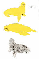
More playing around with shape for the visual language task which I found to be quite successful, particularly the iguanas, probably due to the use of two different coloured sheets of paper and sharpie marker for the blacks.

The final sea lion illustration is an attempt to incorporate some texture into the image which I tried to develop here:


Though this was not successful as the acrylic paint mixed with the quink and made the colours muddy .


A somewhat surreal collage made from different flyers and one of my monoprints to promote a fictional comedy night on the Galapagos. I like the idea of using collage to create surreal beings/scenes.


Monday, 11 November 2013

Studio Brief 4 development

Here are several initial ideas, all based on the Fauvist movement in some way, whether it be through the portrayal of human figures or the use of the quote "A pot of paint has been flung in the face of the public", which is how a critic once described the Fauvist paintings of Matisse

 I then decided I would expand on the skydiving image that I had made earlier, and try and make my set based around that:


I like how it seems to have a narrative quality, with the skydivers climbing the cliffs and then seemingly jumping off. I am also taking the format that the final resolutions will take into consideration more on these pages


Repeated drawings of the figures in order to get the look just right


Thursday, 7 November 2013

STUDIO BRIEF 4 - A Matter of Opinion


For the 4th studio brief I am working from the quote "Creativity takes courage" as said by Henri Matisse.

I have decided to begin the project by focusing on Matisse himself and the Fauvist art movement. These images are parodies of Matisse himself and famous Fauve paintings. The second image is based on "Dance II" by Matisse


Wednesday, 6 November 2013

Photoshop brief cont.


For the third image of the Photoshop brief, I decided to use the colourful background that didn't work so well for the cassette tape on the trumpet. I felt that it worked slightly better, but the lines of the trumpet clashed with the clean lines of the background colours so I decided to places lines with a similar pencil effect on the edges of the colour shapes which I feel works a lot better.


Another photoshopped image, in which I used textures that could be associated with a piano, such as sheet music for the keys and mahogany for the background.


Tuesday, 5 November 2013

Visual Language Study Task 4 - Shape and Texture


Some more monoprints which focus on shape and texture and a more graphic approach to the task using gouache and acrylic to make block colours:


I like my use of acrylic to make a large block of colour, but I want to try and put more texture into the shape to suggest a rock/a cliff.

Studio Brief 3 final pieces


These are the 3 final pieces for the "Day in the Life" brief.

Feedback/evaluation sheets:


  • I'm pleased with the use of a light gouache wash and the controlled darker lines, creates nice contrast and bold images
  • Pleased with the composition of the landscape one in particular, I think it is the best consideration of format
  • Backgrounds could perhaps have been developed in some way, feels a bit simplistic/plain.
  • Wheels on the pram should have been refined 


Photoshop brief cont.


Here's a second image from the A5 series processed through Photoshop. I placed a newspaper texture on the bottle, similar to what I had done for the physical piece because I feel it worked really well there. 
The messy background texture is from a mono print I made at a workshop.
I experimented with the composition by making the image with and without black bars on the edges


Progression of the image with the black borders


Progression of another A5 piece.


Photoshop Brief cont.


This is a coloured version of one of the scanned A5 pieces coloured in. Since it is quite a simple drawing I decided to use simple flat colours, plus a newspaper overlay to make the cassette tape pop out a bit more.


In this version, I decided to maybe add an overlaid newspaper towards the bottom of the image to help make the image more interesting or full and help add to the messy nature of the tangled tape at the bottom of the image.


Another version with a colourful background which I don't think worked well at all and clashed with the image of the cassette tape